Finding the right fit.
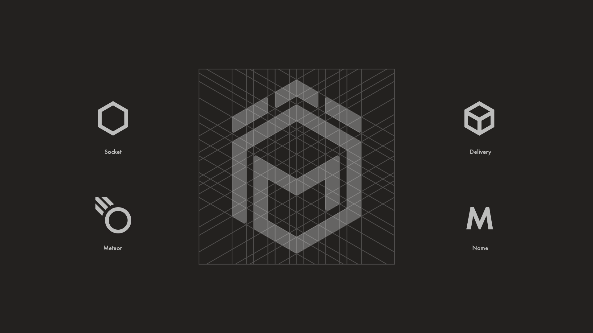
Meteor, a well-established provider of industrial and commercial sockets, sought to elevate their brand identity to compete on a global stage. With a focus on trust, expertise, and innovation, we created a visual identity that reflected their niche product line and rapid delivery service while retaining the strength of the Meteor name and its thematic connection.


The challenge.
Meteor needed a brand mark that balanced several priorities:
Highlighting their niche in industrial and commercial sockets.
Emphasizing their reputation for speed and reliability in delivery.
Retaining the "Meteor" theme, synonymous with dynamism and strength.
The challenge lay in combining these elements into a cohesive, modern identity that resonated with their established client base while attracting a broader global audience.
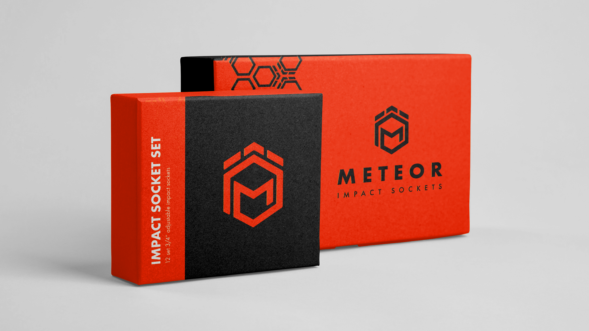
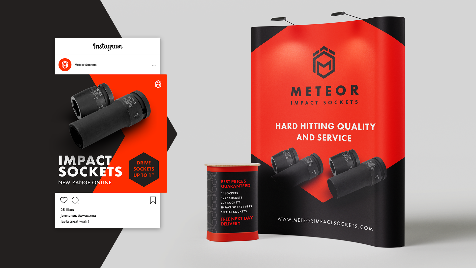
The new brand identity positions Meteor as a trusted leader in the global industrial and commercial socket market. The medallion-shaped logo and interlocking design system communicate reliability and innovation, strengthening their connection with existing clients while appealing to new, international audiences. This cohesive and future-ready identity ensures Meteor is prepared for the next phase of growth.